 Gemini_Generated_Image_7huxco7huxco7hux
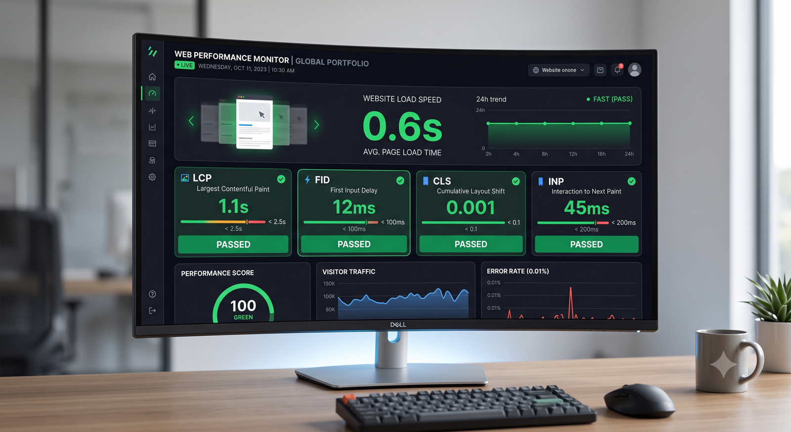
 The Fluid layout is a flexible, responsive content block that pairs media (image or video) with supporting text or elements.
You can choose between a two-column layout for side-by-side presentation or a single-column layout for stacked content. Additional options allow for alignment, spacing, and style customizations to fit various design needs.
Gemini_Generated_Image_7huxco7huxco7hux The Fluid layout is a flexible, responsive content block that pairs media (image or video) with supporting text or elements.
You can choose between a two-column layout for side-by-side presentation or a single-column layout for stacked content. Additional options allow for alignment, spacing, and style customizations to fit various design needs.
 wireframe-transparent-830
 It can automatically adapt between a two-column layout on larger screens and a single-column stacked layout on smaller devices.
* Image remains full-width
 wireframe-image-1900x600-w1
 Fluid
Media Fluid
The Fluid layout is a flexible, responsive content block that pairs media (image or video) with supporting text or elements.